Beyond the Bar Chart: The Hidden Complexity of Building a Production-Ready Dashboard API
Dashboards look like a frontend problem until a month with zero data breaks your growth math. How PostgreSQL window functions and careful edge-case handling keep the numbers trustworthy.
 Vanshit Patel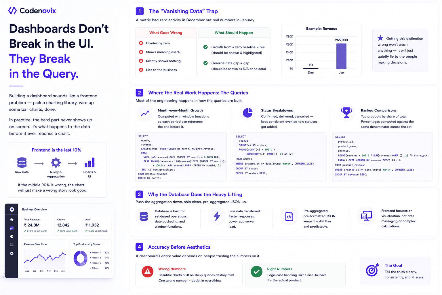
Building a dashboard sounds like a frontend problem — pick a charting library, wire up some bar charts, done. In practice, the hard part never shows up on screen. It's what happens to the data before it ever reaches a chart.
The "Vanishing Data" Trap
The clearest example is incomplete history. Say a metric had zero activity in December but real numbers in January. A naive growth calculation either divides by zero, returns a nonsensical percentage, or silently shows nothing at all — none of which is what a business user actually wants to see. A production dashboard has to tell the difference between "growth from a zero baseline" (which is real and worth flagging) and a genuine gap in the data (which shouldn't be presented as a number at all). Getting that distinction wrong doesn't crash anything; it just quietly lies to whoever is reading the dashboard, which is worse.
Where the Real Work Happens
Most of the engineering here isn't in the API layer at all — it's in how the queries are built. Three kinds of calculations tend to carry most of the complexity:
- Month-over-month growth, computed with window functions so each period can reference the one before it without round-tripping through the application layer.
- Status breakdowns — confirmed, delivered, cancelled — that need to stay consistent even as new statuses get added over time.
- Ranked comparisons, like top products by share of total, where the percentages have to be computed against the same denominator across the whole result set.
Why the Database Does the Heavy Lifting
Doing this aggregation in the database, rather than pulling raw rows and crunching them in application code, keeps the backend thin and the response fast — the database already knows how to do date bucketing and window functions efficiently, and shipping pre-aggregated, pre-formatted JSON means the frontend doesn't have to reason about any of this at all.
Accuracy Before Aesthetics
The lesson that matters most: a dashboard's entire value depends on people trusting the numbers on it. A beautifully styled chart built on a shaky query is worse than a plain one built on a correct one — because the moment someone catches a wrong number, they stop trusting all the others. Edge-case handling isn't a nice-to-have here; it's the actual product.
Found this useful?
Share it with the dev community or cross-post with a canonical link back here.
Cross-posting to dev.to or Hashnode? Use this as your canonical URL: https://www.codenovix.com/blog/dashboard-api-production-complexity
Related articles
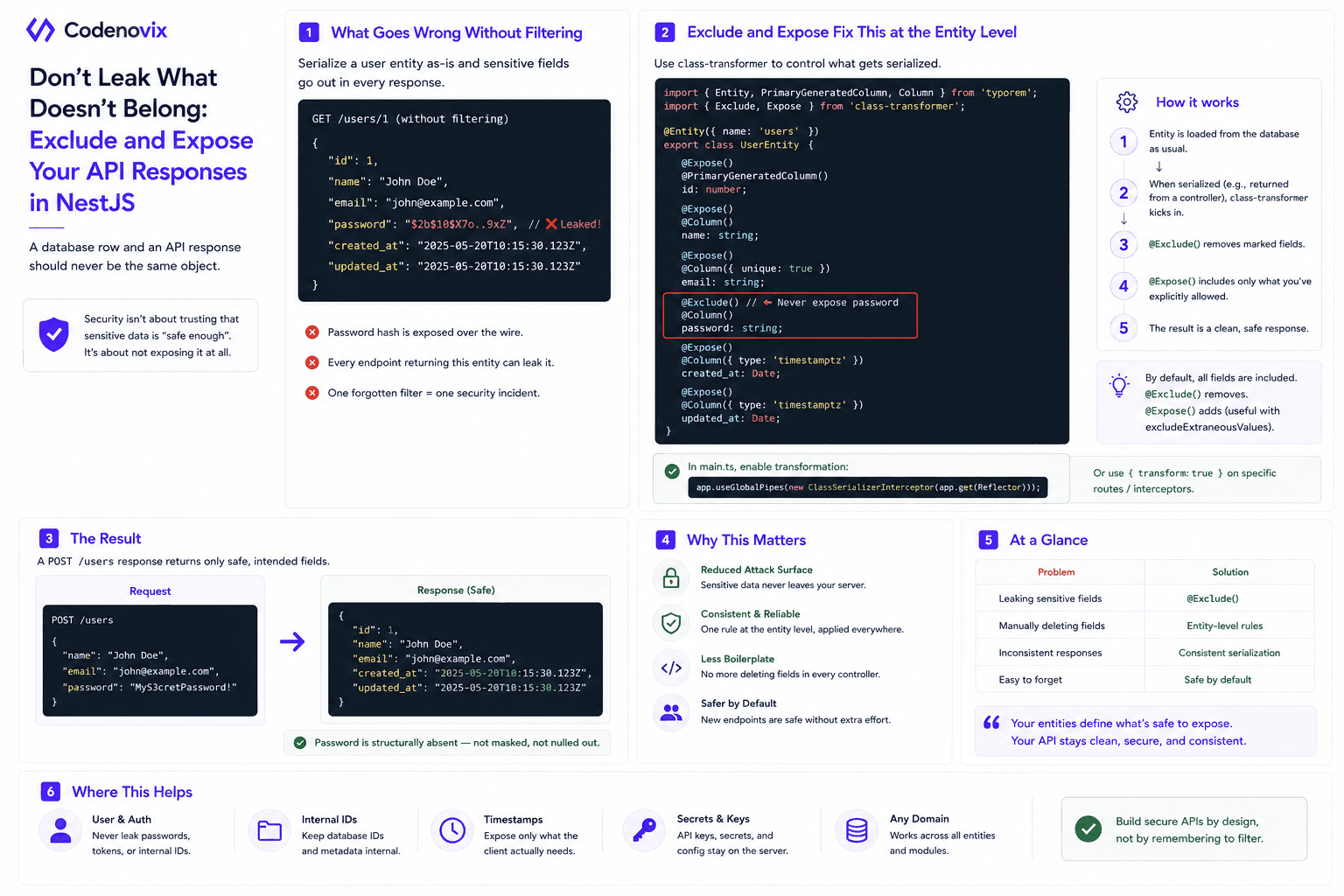
Using Exclude and Expose in NestJS Entities to Control API Responses
A hashed password still shouldn't leave your API. class-transformer's @Exclude and @Expose decorators make an entity define what's safe to serialize, instead of trusting every controller to filter it manually.
 Vanshit Patel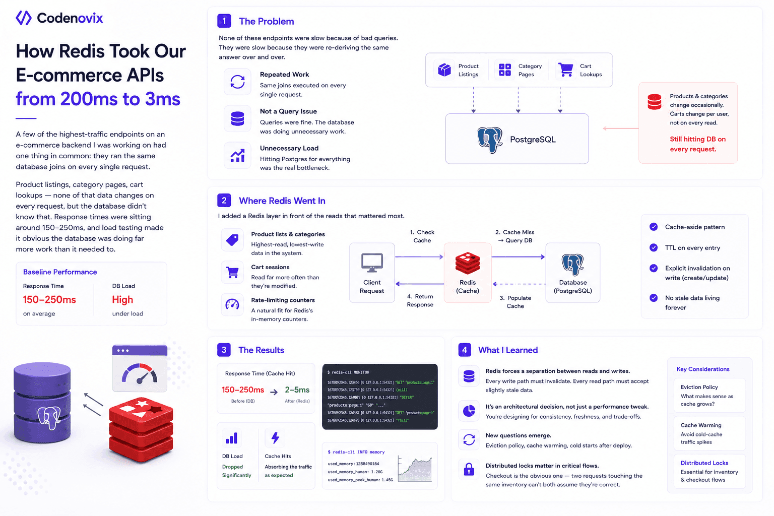
I Added Redis Caching to My E-Commerce Backend, and the Performance Difference Surprised Me
High-read endpoints were re-running the same database joins on every request, pushing response times to 150-250ms. Here's how a cache-aside Redis layer cut that to single-digit milliseconds.
Vanshit Patel
How Designing a Clean Backend Folder Structure Improved Performance and Scalability
A messy backend structure doesn't just look bad — it slows down debugging, onboarding, and scaling. Here's how reorganizing folders into Core, Config, Module, and Shared layers changed both.
Vanshit Patel